A brand can be a powerful thing through integrated marketing strategies, and to get the best interaction with your customers you should remain consistent with your branding through every channel you are on, this includes your website. There is no point in having different branding on different channels as it makes it much more difficult for your visitors to recognize you. Instead, opt for the same colors as all of your other marketing materials such as your business cards, brochures and social media accounts.
In this article, we’ll explore the top web design elements that can either make or break your branding efforts. From colour schemes and typography to layout and user experience, we’ll delve into the key factors that can help elevate your website and set your brand apart from the competition.
Whether you’re starting from scratch or looking to revamp your existing website, understanding these web design elements will help you create a website that not only looks great but also effectively communicates your brand message to your target audience.
Stunning Aesthetics
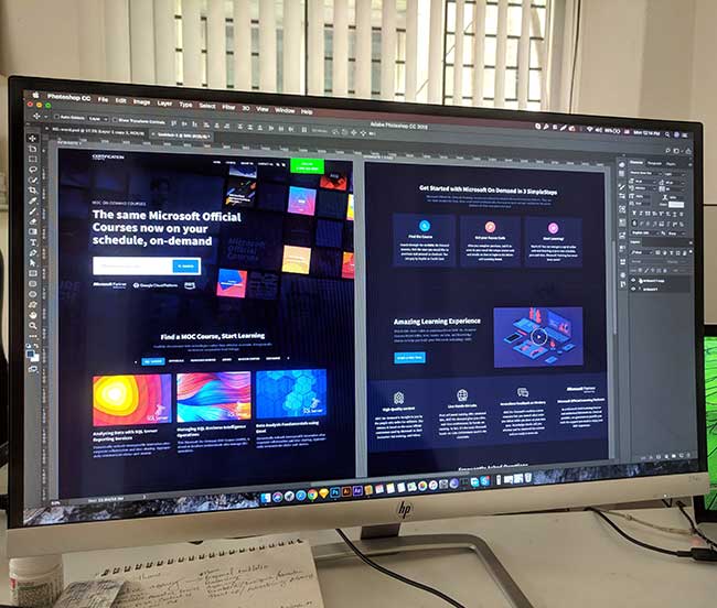
If there is one thing that can kill a brand it’s an ugly website. Nobody wants to be on an ugly or poorly made website. For your website to be a success and stay on par with your branding there are a number of factors you should consider when creating your website. The first is choosing the right brand colours, fonts and imagery. First impressions count when it comes to web design, so make sure you wow your visitors.
If you are wanting your potential customers to take your website seriously, then you need to ensure that it looks great. One way you can do this is by investing in an expert web designer or a branding agency Manchester based in order to get your website and branding done right. The design agency won’t just be able to create a user-friendly website, but they will be able to help you with the right colours, and fonts and understand how to make the website more appealing to your users.
Consistent Branding
A brand can be a powerful thing, and to get the best interaction with your customers you should remain consistent with your branding through every channel you are on, this includes your website. There is no point in having different branding on different channels as it makes it much more difficult for your visitors to recognize you. Instead, opt for the same colors as all of your other marketing materials such as your business cards, brochures and social media accounts.
If you want to create a solid brand, it’s essential to have all website elements consistent with your offline branding methods. Having your web developer and designer at hand will help to accurately represent the brand identity. They will also understand how to incorporate your branding into the web design. Consistency is key for this to work well.
Menu Navigation
If your user doesn’t have a great user experience when they visit your website it can really put a user off and may result in them leaving your website for a competitor. One way in which you can help them to stay on the site for longer is by having every page easily navigable with a mega menu.
Menu navigation should be easy to use and intuitive, meaning that you are showing exactly what users want from your website. The last thing you want is for the user to get lost in your website, as this will just result in them closing the tab and visiting a different website.
If you have a lot of content or products, having a drop-down menu is recommended as it makes everything easy to find.
Allow Plenty of White Space
Empty space, known as white space is vital to good web design. This means that all web design elements should not be cluttered altogether. Not only is this ugly, but it turns users off your website. Allowing white space on your website gives web design elements to stand out and be more visually appealing. It also makes elements easier to find.
To do this, ensure that white space is used effectively, such as to break up the text, highlight key elements and create a visually appealing landing page. Be careful not to use too much white space as it will make the website look empty and unfinished.
Mobile-Friendly Design
Due to Google putting more emphasis on mobile-friendly websites, it is more important than ever to have a website that is easy to use on mobile devices. Over 50% of traffic comes from mobiles these days, but if they can’t access the site properly then your customers may leave the site. If you hire a quality web designer they will be able to make the website mobile responsive that still look good. This means that the website will automatically adjust to fit the screen size of the device it’s being used on.
Mobile-friendly design is essential for a brand to succeed online, so if your trying to do this yourself it could be best to use a plugin.
A Prominent Call-to-Action (CTA)
A well-structured website is one thing to get your users to stay on your website, but to make them want to make a purchase is another thing altogether. A call to action will encourage this. It can be something as simple as a button on the site. For this to get the interaction it needs, it should be prominent and stand out from the other web design elements.
The CTA should be clear and directive as the text should clearly indicate to the user exactly what you want them to do. This includes buying a product, signing up for an email newsletter, getting a quote or simply contacting you. The CTA should always be placed in prominent areas of the page in order for your users to be able to find it easily.
Customer Support Features
If you hope for your customers to love all parts of your brand, it is essential that you make it easy to contact you if they have any queries. If you have poor customer support, this can often be worse than providing a poor service or product, so make sure you have customer support on your website. There are multiple ways in which you can offer great customer support including:
- Offer a direct phone number or email address so customers can contact your brand outside of the website.
- Create an FAQ page where customers can find answers to common questions that are asked.
- Offer a contact form on your contact page in order for them to reach your brand directly.
- Create a live chat that can offer help in real time.
Customer support is a key element to a successful brand. Think of the likes of Apple, SAGE and top companies like these.
An “About Us” Page
Every brand has an origins story, it also has views, beliefs and goals for the future. In order for your customers to resonate with your brand, all of this needs to be demonstrated and shown. One of the best ways to do this is through having an about us page as it lets people put a face to the brand.
It’s super simple to create an “About Us” page, but it is harder to tell a compelling story, so think about what you want to have on the about us page such as information about your team, mission and history.


