
Using the rules of color theory, you can learn how to choose the right color combinations and make designs that look better.
Color theory is the study of how colors work together and how they affect the eye and brain. It is a complicated field that is constantly changing, but there are some basic rules that you can use to make good color schemes.
It is the base for the most important rules and guidelines about color and how to use it to make things look good. Suppose you know the basics of the theory of colors. In that case, you can start to figure out how colors fit together logically, which will help you make and use color palettes more wisely. The end brings out a certain feeling, vibe, or style.
Why Is It Essential for a Graphic Creator/Designer To Understand Color Theory?
The color theory combines science, psychology, and feelings, making color a vital part of the design.
Even if you could be more artistic, there are a lot of tools out there that can help you make exciting visuals. However, graphic design tasks require more background knowledge of design principles. Take choosing a suitable color scheme or design templates as an example. It might seem easy at first, but when you’re looking at the wheel of the colors, you’re going to wish you knew more about what you’re seeing.
Brands of all sizes use color psychology to learn how color affects people’s decisions and how it changes how things look. To stand out from the crowd for the right reasons, you need to know how colors work together, how they affect mood and feeling, and how they change the look and feel of your website.
With the right color choices, you can highlight certain parts of your website, make it easier for users to find their way around, or give them a sense of familiarity from the moment they click through.But you can’t just pick colors and hope for the best. Whether it’s color theory, moods, and schemes, finding the correct HTML color codes, or figuring out which colors for goods and websites are web-accessible, the more you know about using color, the better your chances of success.
The Words That Describe The Color
Before we start talking about theory, you’ll need to know these words:
Basic Colors
All other colors are made up of shades of the primary colors such as cyan, magenta & yellow (CMY) are the primary colors people see. Colors beyond red, green, and blue are combinations of these three in varying proportions.
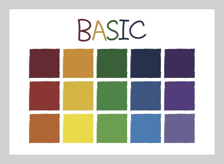
Magenta, cyan, and yellow have been found to describe better how we perceive color than the traditional “primary” colors of blue, yellow, and red. If those colors made you think of printer problems caused by insufficient magenta ink, you’re not the only one. The CMYK color scheme, which stands for cyan, magenta, yellow, and key (black), is based on how color printing works. It is subtractive because red, green, and blue colors are removed from white light.
Secondary Colors
When you mix any two of the three main colors we just talked about, you get a secondary color. Check out the color theory model up above. See how each secondary color is backed by two of the three primary colors?
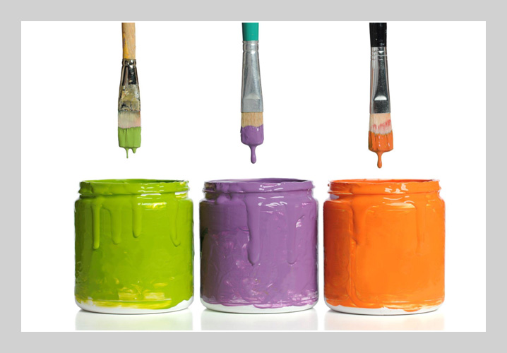
Orange, purple, and green are the other three colors. Each one can be made with two of the three main colors. Here are the general rules for how to make an extra color:
- Blue + Red = Purple
- Red + Yellow = Orange
- Yellow + Blue = Green
Remember that the above color combinations only work if you use the purest form of each basic color. This pure form of a color is called its hue. The wheel of the color below shows how these hues compare to the variations under each color.
RGB and Hex
Other colors can be made by mixing red, green, and blue.
We show colors on the web with RGB (red-green-blue) and hex codes.RGB is an additive color scheme, meaning you add colored light to black to make colors.
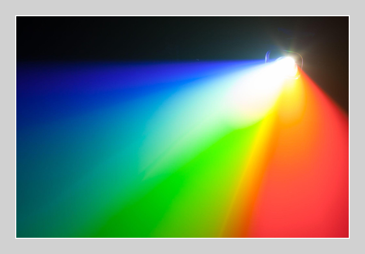
The RGB color scheme says that all colors are made up of a specific shade of red, a specific shade of green, and a particular shade of blue. So,
- RGB (59, 89, 145) is the color of Facebook.
- rgb(0, 0, 0) equals black
- white is rgb(255, 255, 255).
The hex color scheme turns each number into a hexadecimal (base 16) number, like this:
- #3b599b is the color of the Facebook
- #000000 equals black
- #ffffff stands for white.
Every two characters make up a color number. For example, the red hue for Facebook blue is 3b, the green hue is 59, and the blue hue is 9b.
Warm and Cool
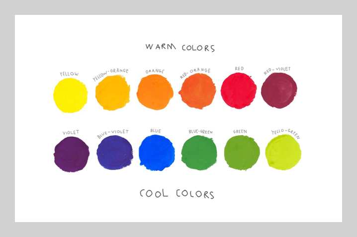
Colors also have a “warmth,” each can be put into one of two groups: warm or cool.
Warm colors have more reds and yellows in them. They can make a design feel warm and full of life. They can also feel aggressive and bold, so mistake messages are often written in red.
Cool colors have more blue, making you think of cold weather, ice, winter, water, night, death, and sadness. They can make you feel about being alone, cold, or scared. On the bright side, cool colors are less aggressive than warm colors, which can also be soothing. Think of a blue sky or the calm blue water at a beach.
Color Temperature
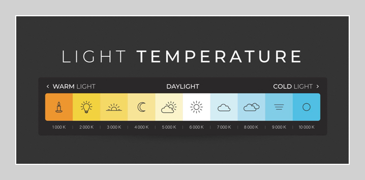
Increasing the temperature of a picture means making it more orange. It usually causes a photo to look warmer and happier, like how the sun’s orange glow makes the world look better. Reducing an image’s temperature, on the other hand, makes it look colder and less attractive, like a day with clouds.
Shades and Tints
Adding white to a color makes a tint while adding black makes a shade. By adding different amounts of white and black to a base color, you can create uniform color schemes with tints and shades, a technique that can be effectively applied to designing nurses’ uniforms for a cohesive and professional look.
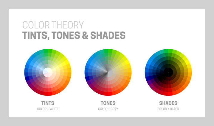
For example, if your base color is #8dbdd8, which is a lightish blue, you can make a monochrome scheme by picking two tints (two brighter blues) and two shades (two darker blues).
Color’s Saturation, Hue, and Lightness
Saturation is a term for how strong a color is. When you turn up the saturation, the color looks deeper and darker; turning it down, it seems faded and lighter. When we say that a color is “light blue” or “dark green,” we talk about how saturation changes.
Hue describes how close or different color is from the colors of the rainbow (red, orange, yellow, green, blue, indigo, and violet). So, when you say “blue-green,” you’re talking about two hues.
Lightness, also called value or tone, is how bright a color looks compared to pure white.
What Each Color Means
Not only do different colors look different, but they also mean different things to us emotionally.
- Red is often linked with strength, passion, or energy, and it can help get people to take action on your site.
- Orange is a happy color, so it’s a good choice for sending a good message.
- Yellow means happiness and smarts, but don’t use it too much. Green is often associated with growth or desire, so it can help your brand seem on the rise.
- Blue can make you feel calm or confident, based on the shade. Lighter blues make you feel relaxed, while darker blues make you feel more confident.
- Purple is luxury or creativity, primarily when used deliberately and sparingly on your site.
- Black is a powerful and mysterious color, and using it can help you make the space you need.
- White means safety and purity, so it’s a great choice to help you clean up your website.
Is it important? Different people may see colors in different ways. The above meanings are popular in North America. Still, if your brand will be used in other parts of the world, it’s a good idea to find out how people in those places will see different colors. For example, in the United States, red is usually a sign of emotion or power. Still, in South Africa, it’s a sign of sadness.
The Wheel of Colors
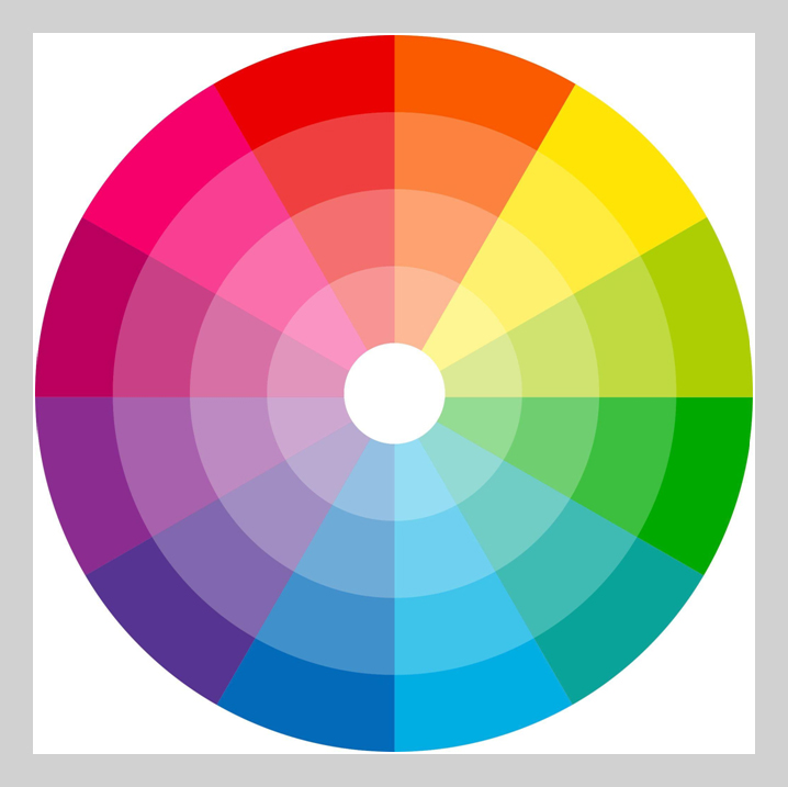
The 12 primary colors used to make color schemes are on a basic color wheel. Each slice of the pie shows a group of colors that can be made by changing the brightness, hue, tint, shade, and mix of nearby colors. Mixing equal amounts of the primary colors (yellow and orange or red and orange) makes color combinations like yellow-orange and red-orange.
The three primary colors are red, yellow, and blue. The third, fourth, and fifth colors are violet, orange, and green. The rest of the colors are tertiary colors, a mix of primary and secondary colors.
It is used to pick one of the five kinds of color schemes.
Five Kinds of Color Combinations
Designers make color schemes by assembling different color groups from the color wheel. This works best if you use one of the following color-harmonizing schemes.
Monochrome
A monotone color scheme comprises different tints, shades, and intensities of the same base color. They go together very well, but they could get boring.
Purple is the only color in this one-color design.
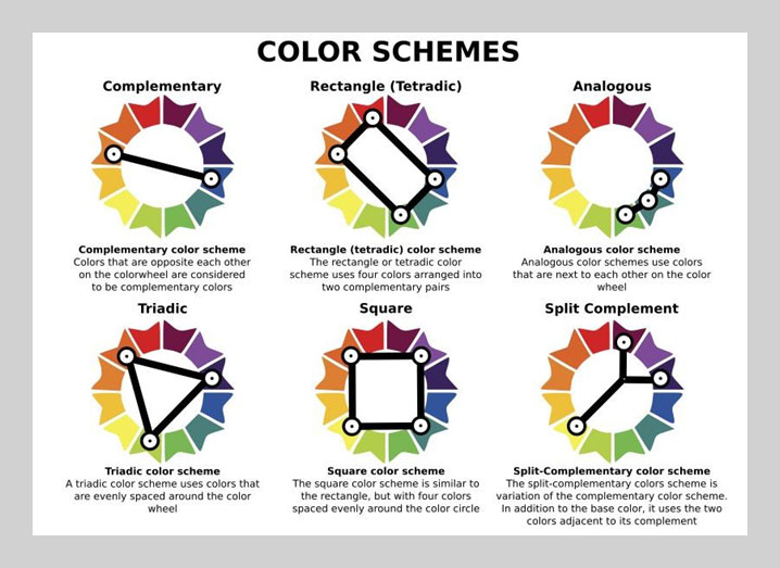
Complementary
Color schemes with complementary colors use two colors on different sides of the wheel of the colors. Because the two colors are so different, these color schemes can have a significant effect and stand out. There are also split complementary color schemes, which use one primary color and two complementary colors that are similar to it. Different shades of green and red go well together.
Pro tip: Choose a color that goes well with what you want people to do. For example, if your background color is mint green, a button in a matching color like red-violet would stand out.
Mint green and red-violet are two colors that go well together.
Analogous
Three colors next to each other on the wheel of colors make up an analogous color scheme. Due to the similar tones, these color schemes can create a very cohesive, unified look without being as dull as a grayscale scheme.
Red, orange, and yellow make up a similar color scheme.
Triadic
Create a triadic color scheme by picking the colors that sit at the points of an equilateral triangle on the wheels of color. This means the lengths of the triangle’s three sides are identical. This triad makes a plan that is both varied and balanced.
Purple, brown, and green make up a triad of colors.
Tetradic
A tetradic color scheme comprises four colors all the same distance apart on the wheel of the colors. Some sites divide these color schemes into squares and rectangles because the four colors can make a square or a rectangle. In a tetradic color system, medium blue, red-purple, spring green, and yellow-green make up the four colors.
Making a Color Scheme and Getting Ideas For It
There are many color picker tools and palette makers that can give you ideas if you need help. Colorado is a tool that lets you pick a primary color or a few colors and then make a color scheme for you. Tools like Coolors, on the other hand, make palettes based on what kind of color pattern you want.
Use Color Theory in The Things You Make
Color is a powerful way to make people feel something and give a brand a personality. Think of brands whose colors make them easy to spot; logo maker created these famous brand like Coca-Cola’s red and Starbucks’ green, as in the case of T-Mobile’s magenta. A brand’s color can be so crucial to its personality that it can be used as a trademark.
Final Thoughts
Using the basics of the theory of color will make your designs more eye-catching, whether you’re looking for colors that go well together for a logo design or putting together a whole color scheme for graphic design. Get out there and use what you’ve learned about color to make your ideas more interesting.